The Premju Emanuele Luigi Galizia Brand Kit provides official visual assets and usage guidelines for press, partners, and collaborators. It includes approved logos, colour specifications, typography references, and imagery of the Premju Galizia Trophy, ensuring consistency and accuracy across all communications.
Logo
Logo Blue
Logo White
2025 Logo Blue
2025 Logo White
Monogram Blue
Monogram White
Usage Guidelines
Maintain clear space around the logo equal to at least the height of the text block reading Premju Emanuele Luigi Galizia. This ensures visibility and balance in all applications. Do not alter proportions, colours, or orientation.
Roboto has a dual nature. It has a mechanical skeleton and the forms are largely geometric. At the same time, the font features friendly and open curves. While some grotesks distort their letterforms to force a rigid rhythm, Roboto doesn’t compromise, allowing letters to be settled into their natural width. This makes for a more natural reading rhythm more commonly found in humanist and serif types.
Premju Galizia uses Roboto Slab for headings and Roboto for subheadings and body text. Both are open-source Google Fonts that ensure clarity, consistency, and accessibility across digital and print applications.
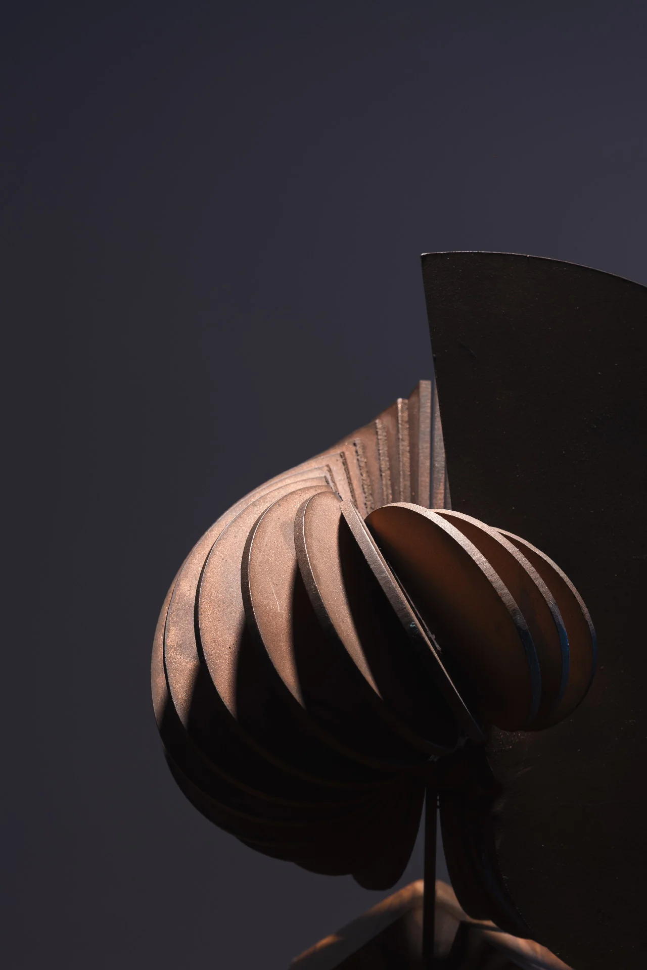
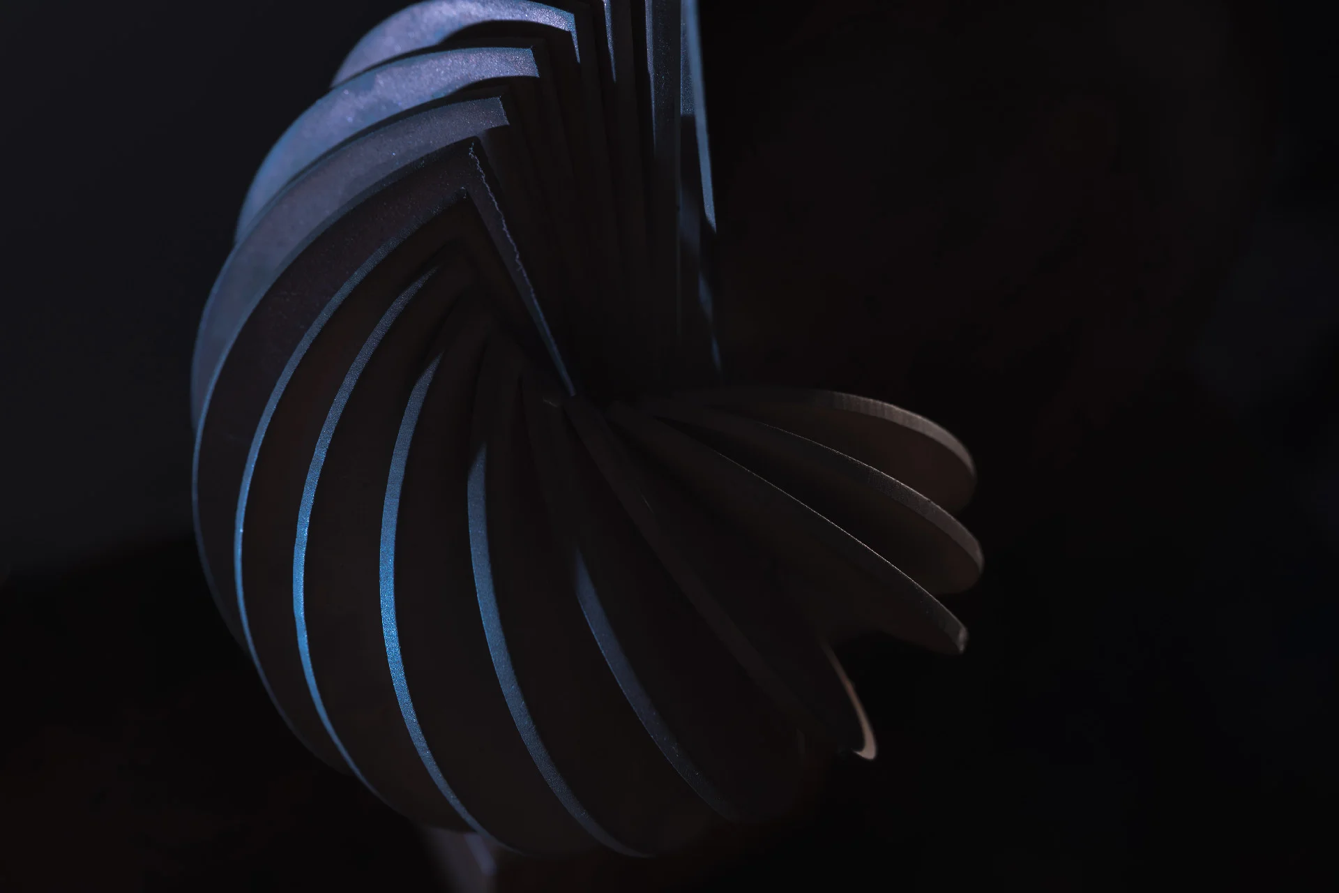
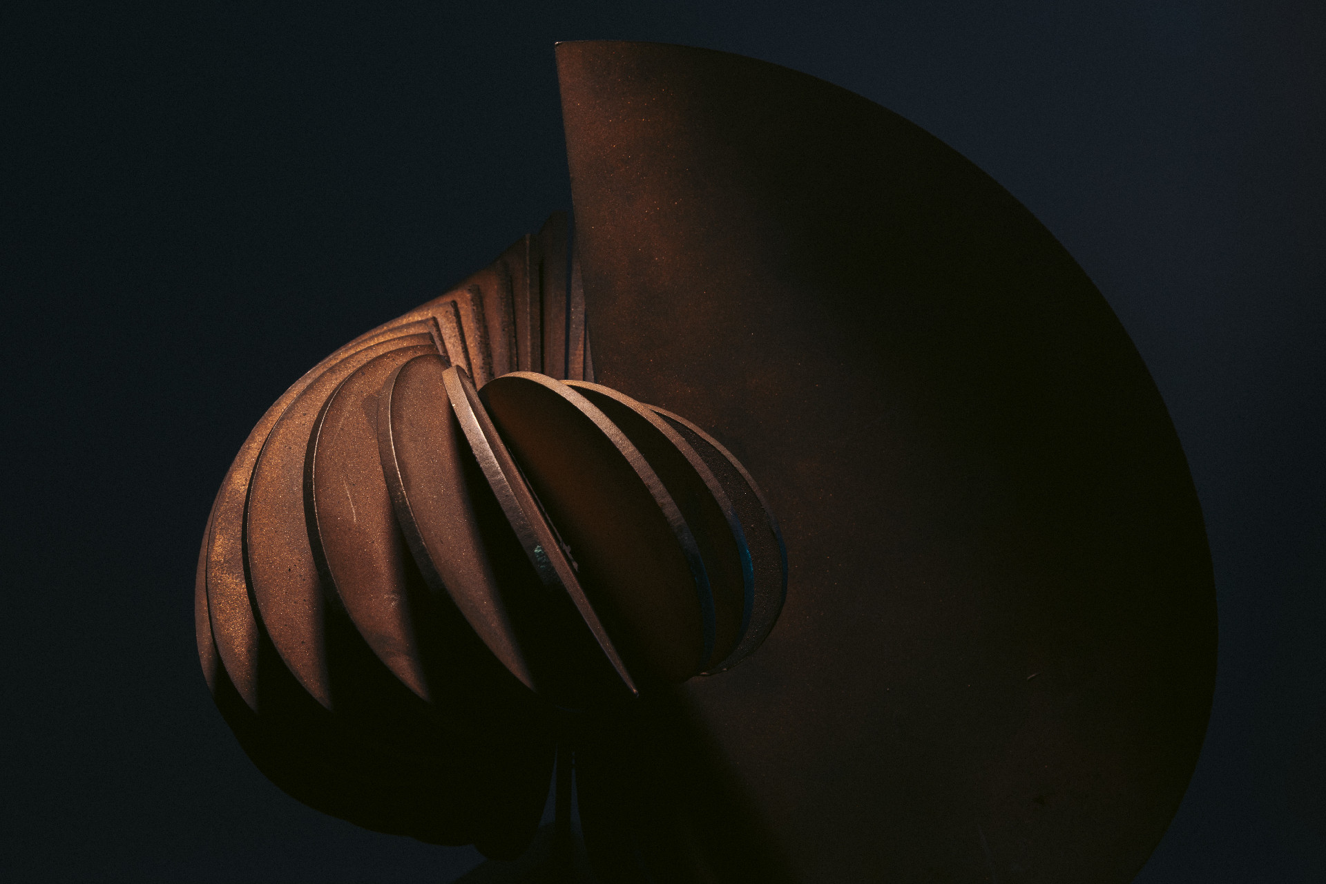
A curated selection of images featuring the Premju Galizia Trophy is provided below. These can be downloaded directly by right-clicking and saving the desired image.
All images must be credited as follows: Photo: Jean Marc Zerafa for Kamra tal-Periti.
For access to any additional photography or image requests, please contact [email protected].


